5 things every restaurant website needs
Most people who visit a restaurant website already want to eat there. They're standing on Banff Avenue, or planning a weekend in Canmore, and they have three questions: what's on the menu, when are you open, and can I get a table?
A good restaurant website answers those three questions in seconds, on a phone, with one bar of signal. Everything else is a bonus.
1. The menu, as real text
The most common mistake I see is the menu as a PDF. PDFs are slow to open on a phone, awkward to zoom, and Google can't read them well, so someone searching for "brunch Banff" may never find you.
Put the menu on the page as text. It loads instantly, reads well on any screen, and every dish becomes something people can search for. It also means you can change a price without asking your designer for a new file.
2. Hours and location people can trust
If your hours on the website don't match Google, people stop trusting both. Keep them in one place on the site, make them easy to update for holidays and shoulder season, and link the address straight to directions.
3. Reservations in one tap
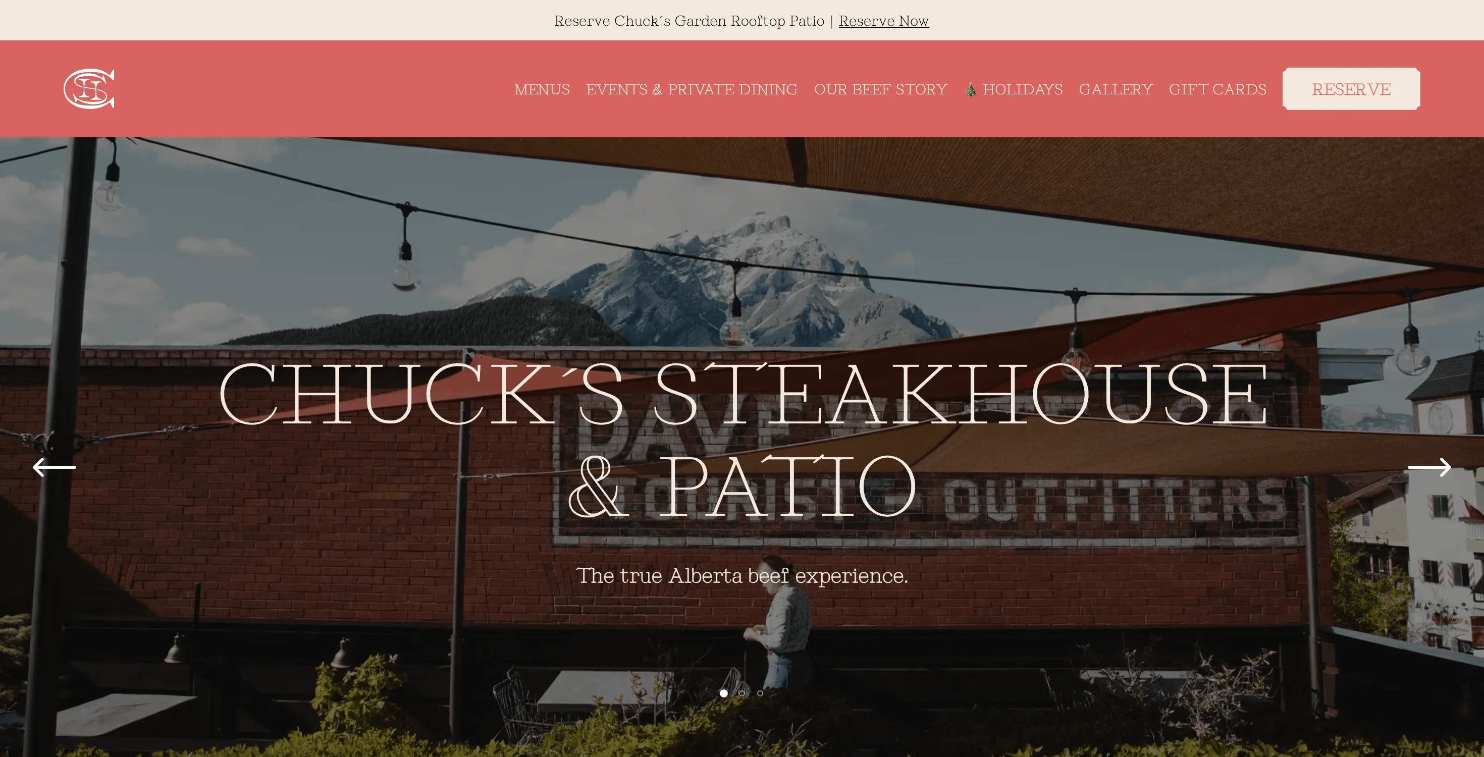
Whatever booking system you use, the "Reserve" button should be visible on every page and open the booking in one tap. For Chuck's Steakhouse & Patio the whole site is built around getting guests to a table without friction.
4. Photos that sell the room
People choose restaurants with their eyes. A few great photos of the food and the space do more than a page of copy. They need to be sized properly, though: a 6 MB photo straight off a camera will make your homepage crawl. Every image on the sites I build is resized and served in modern formats, so the site stays quick.
5. Specials your team can post themselves
Happy hour, a new seasonal menu, live music on Friday. These change every week, and they're exactly what gets people through the door. If posting them means emailing a developer, they won't get posted.
Magpie & Stump is a good example: the team updates menus and specials themselves, so the site keeps up with the restaurant instead of falling behind it.
What you can skip
- Auto-playing video with sound
- Pop-ups before people can see the menu
- An "intro" page between visitors and the homepage
- Long paragraphs about your story above the fold (keep it, just lower down)
The short version
Menu as text. Hours you can trust. Reservations in one tap. Great photos that load fast. Specials your team can post. Get those right and your website quietly fills tables every night.
If you'd like to see more of what this looks like in practice, I've written about how I approach restaurant website design, and the portfolio has a dozen restaurants and bars across the Bow Valley.